Final Outcomes...
- amiedodgsonart
- Jan 28, 2020
- 8 min read
Updated: Mar 30, 2020
After looking over my creative practice I looked at what I wanted to develop further.
The Plan
I plan to take some of my own images of people with varying emotions, manipulating them and taking some inspiration from my previous gendered objects project where I cut parts of the image out to create a contrast between genders - this time I plan to use the same person, but make a contrast between two emotions, happy and sad. This is after reflecting on the initial primary research I did on people wearing masks and to show what emotion is shown on the outside, isn‘t always what is going on in the inside.


Following this, I plan to print the image out and either solar etch onto already marbled inked pages, or marble the pages afterwards. I have a feeling the ink may run when I wet the paper so this may not work. Or it will be a happy accident. This will also tie in nicely with the Hans Arps research I did on chance art work. I really love using the inks as you never know what kind of effect you’re going to get. I will experiment with both to see which works. I will also do some print proofs and experiments with composition on the paper. The colour ink I will use will be black and also some in blue. I would like to experiment with more coloured inks however there is only blue and black ink that I can open and that isn't dried up.


I have also had an idea of looking at how putting the images next to one another looks and how I could create a long piece of wall art with the same faces, or to do more solar etchings of different peoples faces and see how they could connect with each other. It would give the sense of us all being connected somehow and through the masks we all wear.
To take it further, if I have time after they have dried, I'd like to sew in the image. Possibly sew two images together. I would try varying things. Below are some tests I tried with different coloured cottons on to the marbled paper to see which colours worked. The yellow and the light blue worked well. The lighter colours seemed to work a lot better aesthetically than the darker colours such as red and navy blue.

Furthering this project into another project and after reflecting on my research into synesthesia I am planning on looking into Kandisky's work, the spiritual and the Chlandi experiments using a speaker and various other equipment to see how I can generate sound resonance through water using a range of different music, happy, sad etc and try and fit the music to the emotions in the pictures. This project would be very in depth and would need a lot more research than what I have time for therefore I have taken this aspect out of my final plan and to concentrate on just the emotions in the images and experiment with the colours to see what will be the most successful.
The Process
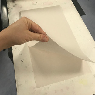
I had two pieces of marbled sheets leftover from my experiments, so I printed on to them first.
They were 2 A5 sheets, and needed to be A4 so I stuck them together in the middle with masking tape. This was an issue when I had put it in water as the stickiness came unstuck when soaking them. I decided once I had inked up my plate to carefully lay them across instead.
I needed different sizes of newsprint for the registration sheets, I cut these to size. I needed an A3 and A4 size. Also double sized folded newsprint to go underneath and to cover the print to protect when going through the press. It took a long time and lots of arm muscle to ink up each slab. I began at 8am and finished the process by 2pm. I made sure I used print fingers to collect the prints from the press. I made sure I soaked all my paper before printing and made sure I wore gloves and an apron. I printed a Blue print onto marbled paper, blue onto plain, black onto plain,


The Results
Blue ink on Marbled

Blue ink on plain

What worked well and what didn't:
- The blue on the marbled gives a very bizarre look but it is effective.
- The orange bits look like rust and the blue makes it look like a blueprint. I love this effect.
- It looks quite chaotic, which I like, due to the nature of the chaotic moods in mental health.
- The blue works however I don't know if the colours clash a bit, orange and blue?
- The one thing thats frustrated me about all of these prints is that when I photocopied them before making the etching plate, thumb marks were put on the acetate before going into the UV machine! SO what I want to do is make another image without the thumb prints, if I have time OR not to put as much ink in that area so they don't show up.
Even better if:
- A3 sheets of marbled paper so they were two and there would be a border round.
- Sew into the bored to create texture.
- If I had different coloured inks I would try a series of different colours to represent the different emotions.
- Red to represent anger on the face on the left and right and yellow to represent happiness on the one in the middle
- A combination of complimentary colours for the marbled effect and the inks.
Black Ink on plain

Double print, black ink on plain

What worked well:
- The black ink is always effective. Giving a darkness to the image and a vintage feel.
- The double image and the fact the faces in the middle almost line up and create a new face.
- The deep shadows and contrast are very effective, especially on the double image. I love how the one on the right is a ghost image of the left one and its like its fading into the background but is still part of the image.
- The composition of the two images, the right one looks like its sliding from behind the left.
Even better if:
- More colour was applied using Chine Colle.
- Different coloured inks to explore emotions again.
- A longer piece of paper that has multiple images printed on, side by side.
- Taking more images like the one of Katy but of some other people and making a series but all connected together.
Black ink on plain with multi-coloured Chine Colle

What worked well:
- The chance effect of the collage works well, looks at how different colours can create different moods within an image and how these moods are scattered and unpredictable.
- The coloured tissue works really nicely against the black ink, it gives it contrast and makes parts of the image pop.
Even better if:
- More Chine Colle, to create a mosaic effect all over image.
- Sewing different coloured cottons into the paper outlining certain features.
- Sewing many faces together.
- Chine Colle over each face representing different colours for different emotions, alternating between them and actually, when you look at one colour, you would think it would portray a certain emotion, but actually mixing them up for each emotion would be quite good - it would give a sense of not being able to trust that each colour is for a certain emotion.
Printing on different pieces of paper

What worked well:
- That they looked like David Hockney joiners.
Even better if:
- I stuck them down with a gap in-between, this would show the broken ness someone feels when someone is suffering with a mental health condition.
- Printing a few in coloured inks, mixing them up and joining different colours together.
Printing tests on wallpaper liner and trying upside down

What worked well:
- I tried mixing it up with this one and layered up a bit more which was effective.
- The longer paper worked well as I was able to just carry on.
Even better if:
- Printing on the wallpaper gave me chance to see how it would look more than just the two next to each other. What I would like to do to push this project further is definitely take pictures of more than just one person and do a whole roll of wallpaper, or do a live installation of the faces and heads moving somehow and interacting with each other. Giving that sense of all being connected by the different masks we wear, but also by the giving the sense that sometimes people wear other peoples masks.
Printing black repeated onto solar etching paper

What worked well:
- The three of them worked well together and on etching paper, giving a nice clean finish and look to the image.
- I like the fact the first one is really clear and I have managed to line up the right hand face with the left hand face of the next one. It makes it look disjointed but in a really good way.
- I like that the first image is dark ink and the last one fades slightly, that wasn't on purpose but again, a 'happy accident'.
Even better if:
- I would like to carry on with the 3 images and on etching paper to give a clean cut finish, but try using different coloured inks.
- Mixing my own colours of the rainbow out of the primary colours available.
Rainbow series

What worked well:
- I am super pleased with how these turned out, theres something really effective seeing the colours of the rainbow in order.
- The consistency of the ink on all of them looks great too.
- They remind me a little bit of Andy Warhol's pop art.
Even better if:
- Using different coloured inks on one plate, picking out different faces or features.
- Doing the same about of prints but using black ink and using Chine Colle doing the idea of cutting out different colours for each face, to try the idea I had earlier of mixing the colours and emotions up.
Chine Colle over the expressions/faces
Preparation for this was key. I needed to prepare the tissue for the Chine Colle prior to inking up and soaking my paper as it took quite a bit of time to choose the colour combinations and trace them over an already printed image.


Printing these was tricky. I found that when gluing the tissue, to leave a space at the bottom so I was able to place onto the plate without my fingers constantly sticking to it was the most successful way! I always made sure I washed my hands between printing incase I had got any ink on my fingers it wouldn't go on the tissue.
Using a long piece of newsprint on the bottom of the press and over the top of the press was the most successful way to roll these prints through the press as I needed to, on the middle image, to put half of the blank paper already through the press in order to get the image to print and not take up ink off the already printed image.

What worked well:
- I am really pleased with how these turned out, the colours are really punchy using the tissue.
- The colour combinations work complement each other.
- Each colour creates a different dynamic to each face.
- The juxtaposition from black to colour emphasises the emotions
- I like how you can see ghostly images and expressions through some of the prints.
Even better if:
- As I have said in previous reflections, to push this further I want to create a big wall piece on wallpaper, with many different faces and emotions, intertwining and crossing over each other.
Solar etching this would be a big task so I would have to think about how I would do this, what materials and what methods I would use.
- I think these would look great printed onto a T-shirt, possibly as a sublimation print.
- Doing this process with the faces and photo-manipulations could be transferred to many other mediums such as using etching using a Rhenalon plate, sublimation printing, screen printing.
Comments