Double Exposure...
- amiedodgsonart
- Nov 20, 2019
- 5 min read
We were introduced to double exposure within photography today on Photoshop.
Double Exposure is a photographic technique that mainly involves combining two exposures to create a single image. The technique produces very interesting results and allows the photographer to produce ghost images and mirror images that tell a story in a unique way that can't be achieved with a single photo. This technique lets you add drama and creativity, set a certain mood, or even achieve an unexpected effect that can move your viewers. They can be found on album artwork, posters, advertising campaigns, anything that wants to push a little art without detracting from the product or idea. However, it doesn’t stop with stills photography.
This technique has been used in tv and film and usually in the opening credits.
Dramatic, unusual photos don’t have to be manipulated in Photoshop. A double exposure gives you a great dramatic shot without the need to re-touch in Photoshop. A double exposure is two images, exposed on the same sheet of film—or in the case of digital, the same digital file. On most modern digital cameras, a double exposure can be done in-camera, without any post processing at all.
My starting images
I chose one of Ffion that I had taken in the gender project as I really loved this photo, its a portrait on a white background. I also took a landscape from my flat window of trees because I love the view. If I were to do this again I would have a concept in mind, however because I was just practicing this technique I stuck with images I already had. I also missed the session on this, so I did this at home following the powerpoint tutorial.


The process
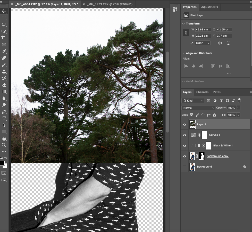
I began by isolating my subject from the background. To do this I used the Quick Selection Tool (W). From the menu I clicked Select and Mask. The tutorial told me to be more precise by using the Refine Edge Brush, however I found that this didn't work well for me so I chose the brush edge tool instead which was the tab underneath.

The next step was to zoom into my image and using a smaller brush go around the areas that hadn't been selected and very accurately brush them back in or away. I did the whole image painting back in parts of Ffion's shirt and hair. I also left the shadow in down the left hand side of her body for effect. Once I had been over the entire image I clicked output to: New Layer with Layer Mask.

The tutorial then told me to Alt click the layer mask to fine tune even further, however I didn't feel it needed anymore fine tuning.
The next step was to create a new adjustment layer Black & White and alter the setting to create a good neutral tone. I adjusted the Blue, Red and Cyan layers to create a neutral tone.

The next step was to create a new adjustment Curve layer and create an S curve to give the image more contrast. I didn't really like this effect. So I went back to the previous adjustment and adjusted to get even more of a neutral tone, then proceeding with the curves layer I adjusted to create more contrast.

I dragged my landscape image onto my portrait using the move tool (V) and made sure it was at the top of my layers. I realised quite quickly that this wouldn't work due to the fact the landscape was still horizontal and I wanted it to be portrait to match the image of Ffion, so I deleted it from the screen, went back into the open landscape picture and changed it in image rotation and flipped it 90 degrees clockwise.
The next step was to change the blend mode to Screen and began to see the effect coming together. I dragged the landscape around until I found a place where it became most visible. I found that the darker areas of the portrait and landscape showed up better. I had a play around with it flipping the image horizontally and vertically, however this was the placing I went with.

By hovering between the Landscape and Portrait layer and holding Alt and click, I was able to apply the mask to the Landscape.
Once my two images were layered together I was able to create a background. I highlighted my Background layer and from the Layers panel, created a new adjustment layer > create a gradient and followed the steps to choosing a Gradient layer adjustment. I clicked on the gradient fill and this opened up the gradient editor panel. I selected a pale blue/cyan/pink gradient and applied it, making sure it was just above my background layer.
The next step was to unlink the landscape and portrait by Alt clicking between the two.
Then on my layer mask I held down Alt and dragged the mask to my Landscape image and released, this made a copy of the mask to my landscape.


I selected the Portrait layer and changed the blend mode from Normal to Multiply and this darkened the portrait. The next step was to select the Landscape and create a new adjustment Levels layer holding Alt to link it to just the Landscape layer. I added more contrast to the landscape by dragging the shadows from 0 to 15 and the mid tones from 1.0 to 0.7 and left the highlights alone.
I had trouble with the next steps of the tutorial as it said to 'use your brush tool (B) you can now control the mask on the landscape to be more fluid. Select a soft black brush, lower the opacity to 30% and start painting parts of the landscape away.' I couldn't do this for some reason. It wouldn't paint any of the landscape back in around the outside of the image of Ffion, only when I was on her I was able to do it. Therefore I did paste some of the image of her eyes back in. I tried removing the layer mask and adding a new one to the landscape and that didn't work. I also tried going back through the steps again to make sure I hadn't missed anything, however I couldn't work it out.
When taking a step back and looking at my image, I was actually really happy with the way it turned out without having to paste back in any of the landscape. It almost reminds me of a Dada image. Below is my end result with the layers looking similar to the ones in the tutorial.

Here is my final image as a Jpeg. I made sure to save a layered file also.

What worked well:
- The colour scheme.
- The image of Ffion against the trees. I like the way the trees are only in half of her body.
- The position of the trees.
- Having half of her body missing but still being able to see the outline.
- The faint image of the trees over her face works well.
Even better if:
- It would be nice to be able to go through it with my tutor and find out where I went wrong on pasting the landscape back in, just to see what it looks like.
- It would be good to try some different colours also to see what kind of mood or message they could bring to the image.
- I am wondering whether I could do the double exposure technique with a pin hole camera? Maybe some research into this would be good.
- To make a solar etching out of this would be great! It will give it a vintage feel as it looks quite modern using this type of editing on Photoshop.
To take this technique further I would plan my concept properly and execute it with thought and more time on my hands. I feel that I could do a lot better and really play with the results, especially for the inside outside project. Thinking along those lines and to stay In keeping with my original thoughts, I could do a landscape representing how someone might feel on the inside, for example, a dessert, barren land, but then they're smiling on the outside.
Comments