Mixing Genders Outcomes ~ Photo-manipulation
- amiedodgsonart
- Oct 30, 2019
- 5 min read
Updated: Nov 12, 2019
To carry on with my theme of gender photo-manipulation I tried various techniques in photoshop to bring my idea of mixing genders and challenging gender norms. Having done an image similar to the one below before a few years ago and having really liked the effect, I decided to try it with Katy & Dave and felt it would tie in nicely with the gender theme. Opening up both images into photoshop, I selected image size in Dave's picture and then rotated the image of Dave upside down. Then dragging each image into a new document. By matched up the edges of each image so that their shoulders and torsos were touching it made it look like Dave was a reflection of Katy. The contrast of the images and exposure on the background didn't quite match, so I added an exposure layer and then a mask to paint out Katy and Dave. By adding a blank layer I used the clone tool around the edges of each image to take out any spots on the background that were darker in places so the background looked clean and white. My image was then complete and I am really happy with the results. It reminds me of a playing card which I quite like as gender can be played around with as I am showing in my masculine women and feminine men series.

The stance and attitude of each model matched brilliantly. The way I had planned the shoot also worked well with the outfits I chose for the models and the make up ad moustache. The post-production overall worked really well for this and I would like to develop the playing card theme further and possibly do a series of gender playing cards. It could work even better in monochrome of with Dave on top of Katy instead.


The process for this image took a long time to do. It involved masking and saving certain areas of the images and then adding effects to the outside of the areas such as outer glow to make the edges stand out. From this image I feel that again, the expressions from models worked really well and the monochrome, as there is a lot going on I feel it being in colour would be too busy. I really like the overlapping effect and this carries on as a development from my original research from David Samuel Stern and trying the weaving effect in 2D.
As I found in my 2D weaving, it seemed to work better with a smaller weave so on the next images I work on I will use smaller slice so the eyes aren't lost as you can tell a lot from an image from the eyes. I also feel it would look better with a black background instead of white.
~~~~~~~~~~~~~~~~~~~~~~~~~~

What worked well:
- the faces
- the slicing effect so I could get all of each picture in
- colour
Even better if:
- smaller slices and zoom out so you can see the shoulders.
- monochrome
- graduating slice size from small to big on one side
~~~~~~~~~~~~~~~~~~~~~~~~~~~~~~~~~~

What worked well:
- the blending of their faces
- low saturation on the images
- the negative space around the models
Even better if:
- try in monochrome
- Try Beth underneath instead of Oscar and see how it looks
~~~~~~~~~~~~~~~~~~~~~~~~~~~~~~~

What worked well:
- slicing in the middle of the image
- the contrast between colours
- you can still see the eyes
Even better if:
- try in monochrome
- Try Beth underneath instead of Oscar and see how it looks - I will try this below.
- Slicing horizontally instead of vertically
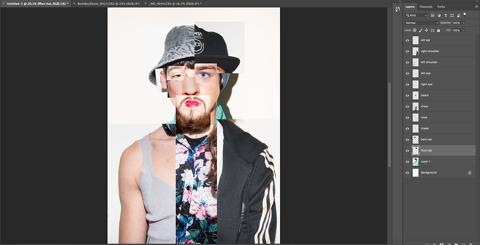
The process I used to get this effect:
- Opened the images in Photoshop from Bridge.
- Then to camera RAW and pressed command and made sure both were selected, opened images.
- I cropped the image of Oscar to the same size as the image of Beth. H: 43.89cm and W: 29.26cm. However I found when cropping the image of Oscar, because his was done in landscape, I struggled with the height.
- Using the move tool I dragged the image of Oscar over into the image of Beth and free transformed Oscar to fit Beth by turning the opacity down.
- I made a background copy of Beth and dragged that so it was the top layer in the ones below, however for the ones where Oscar is on top of Beth (above) I did vice versa.
- By clicking new guide layout I was able to create guidelines for making my slices.
- Using the regular marquee tool I dragged down the guidelines across the face and into the torso missing one every time by holding shift so more than one were selected at one time.
- By making a masked layer on Beth I was able to turn the feathering up to 127.3 px for more of a see-through effect and for the more sliced look I turned the feathering down to 2.7px. I used this technique but vice versa for trying Oscar on top (above) and then Beth on top (below).


After experimenting with putting Beth on top of Oscar and vice versa, I feel the strongest image is this one.
After reflection I decided I would it in monochrome to see how it would look and to see what the contract would be like. Opening the image in photoshop I added a black and white layer and changed the colour channels. I pushed up the red channel to bring out the skin tones and to give more contrast. I really like this image however my favourite is still the colour. I would like to use them all as a series for my body of work and presentation as they show a process and once I had printed them out and saw them together I really liked them as a series, with the monochrome in the middle.


~~~~~~~~~~~~~~~~~~~~~~~~~
Following along the lines of manipulating genders, I wanted to create one face out of all the faces I had taken pictures of. My first attempt is below and I wasn't overly happy with it. The eyes worked, however I feel the nose and head weren't working or looked right.

I developed it further by taking bigger portions of the faces to add and adding in shoulders. I felt this had started to look better and more realistic, however I wanted to push it further.

Making sure I labelled every layer so I wouldn't get confused when playing around with them and using free transform to make them fit. Im quite happy with the end results.


~~~~~~~~~~~~~~~~~~~~~~~~~~~~~~~~
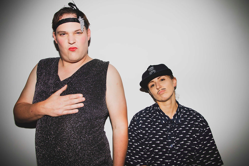
Here are some shots I took of Drag Queen Dave and Ffion as a boy. I really love how I've captured their personalities in these shots. They were both amazing to work with! I will be doing some final outcomes of the individual shoots with them two and merging their separate shots into one photo-manipulation and a magazine cover.


Comments