Text over imagery Workshop
- amiedodgsonart
- May 11, 2020
- 8 min read
Updated: May 18, 2020
I was introduced to adding text to imagery to create a powerful image.
For this workshop I needed a close-up portrait, looking straight to camera. I didn't have one so I used my tutors resources that were provided as downloads from google classroom. I was advised that the portrait could be colour or black and white, but the effect
worked better when working in black and white. The resource provided was a black and white but for future reference, to change a colour photo to black and white we would need to
desaturate it. I did this by pressing CMD + SHIFT + U or create a Black & White adjustment layer.
As my image was against a black background I didn’t need to make any selections. Once my
subject was selected, I created a solid black colour behind it. I brought up the rulers either side of my subject by pressing View>rulers. I then dragged the guide to the centre of the subject’s nose and created a New Layer. Using the Rectangular Marquee tool (M), I selected one half of the
image and pressed ALT + DELETE. I was advised that the side with the least shadows works best and then pressed CMD + DELETE. I pressed CMD + D to deselect and removed the guide.
I moved on to make 2-3 duplicates of the black layer and hid all but one of them. These were do later, if I wanted to try different fonts and sizes, I could do using those layers.


I then selected our Type Tool with the shortcut T and played around with various fonts and sizes to develop the image. For this workshop we selected the following text settings and were advised that bold fonts tend to work best. Impact > Regular > 24pt > Sharp > Align Right > White.

I wanted my text to align to the centre of the image so made sure to select the correct text alignment. I chose to align our text to the right, next to the face of the gentleman.
I used a quote that our tutor had found but was advised to have my text ready when working on my own image; researching quotes that go with the image I'm using.
I moved on to place the cursor close to the top and middle of the image and began typing in my text.

I opened my Characters Panel, and was advised that if the panel wasn't visible to go to Window > Character or click on the Character Icon.

I adjusted the Leading in the Characters Panel, to achieve small space between the lines to produce the most effective results. As I adjusted the text size and vertical scale I
needed to re-adjust this as I went along. (Fig.1)
I was advised that my text should fill half of the face, however this will vary from portrait to portrait. (Fig.2)
To achieve this I needed to adjust the font size, leading size, vertical scale and the horizontal scale. Below are the settings I used (Fig.3)
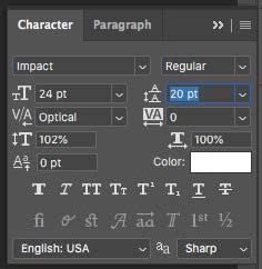


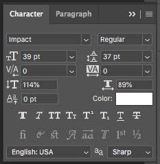
Figure 1. Figure 2. Figure 3.
I then clicked off the text layer and back onto it again. Once the text was in place I needed to turn this into a selection by pressing CMD + clicking on the T icon on the text layer. (Fig.4)
With the marching ants on my text selection, I then hid the text layer and made the black layer active. (Fig.5&6)
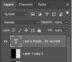


Figure 4. Figure 5. Figure 6.
When working on the black layer, I pressed DELETE to reveal the image behind the text. I then pressed CMD + D to deselect the selection. I then needed to go back and adjust the text to fit better with the details of the portrait and ended up with the image below.

There were areas of the image that I wanted to be made darker and lighter to help make the text more legible. To do this used the dodge and burn tool (O) on a separate layer so as to destruct the current layer. I created a New Layer above the portrait and filled this with 50% grey with a blending mode of Overlay. With my New Layer active, I pressed SHIFT + DELETE to enter my
Fill dialogue window and selected 50% Grey from the contents box and pressed OK.


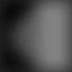

I then changed my Blending Mode to Overlay and the grey disappeared which made it look like the below images.


I was then able to dodge and burn on this layer non-destructively. To brighten the darker areas I used the Dodge Tool, making sure the range was set to Shadow/Midtone, exposure 50-100% and ticked Protect Tones and a brush hardness of 0% (soft).

Then I began brightening the darker areas of the portrait. To darken the brighter areas I used the Burn Tool, making sure the range was set to Highlights/Midtones, exposure 10-50% and ticked
Protect Tones. Then I began to darken the brighter areas of the portrait. I played around with it and also made the text smaller. Before and after dodging I saved my image and below was my finished result which I am really pleased with. I can't wait to try it on my own portrait and using my own quote!

For this workshop I needed a close-up portrait looking straight to the camera, I began using one from the resources provided, therefore the image used is not mine.
The portrait can be colour or black and white, but we were advised that the effect works better when working in black and white, same as the last workshop. Also like the last workshop, this technique works best when the subject is against a black background.
I firstly needed to separate my subject from the background, by making a quick selection (W) and painting around my subject or using the Select Subject option, the selection didn't need to be
perfect.

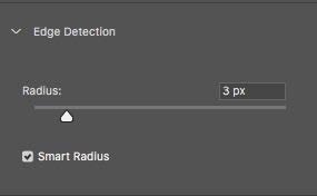
I then clicked on Select and Mask to refine the edge using the following settings. View Mode: View on Black > High Quality Preview > Opacity 100. Edge detection: Radius 3px > Smart Radius checked.


Using the Refine Edge Brush I carefully selected a brush size that allowed me to brush around the outside of the person without affecting the hair and skin too much.

Then I clicked, Global Refinements: Smooth 0 > Feather 1.5 px > Contrast 0%
> Shift Edge -1%
Output Settings: Decontaminate Colour = Unchecked > Output To = New Layer with Layer Mask > OK. My portrait was then on a transparent layer.


I then created a New Solid Layer, selected Black as the colour, clicked OK and dragged below my subject layer.

My image was still in colour so I changed it to Black and White by pressing SHIFT + CMD + U which desaturated it. I also tried creating an adjustment layer: Black & White which let me adjust the various colours to grade the image. I tried this on two separate layers to see which I liked best and went with the new adjustment layer as it gave me more play with the grading and toning.
I went on to open the Document list and selected New and Named it: Displacement and clicked OK.

I went to, Filter > Blur > Gaussian Blur and blurred by about 4 pixels. We were again advised that the amount needed to blur.

I then clicked File > Save As > PSD Photoshop file and closed the image. I was then ready to add my text. I used this site for my text generation: https://www.jasondavies.com/wordcloud/
Here I was able to copy and paste my text and adjust the orientations. I wanted only horizontal and vertical text so set it to 2 orientations from 0 to 90 degrees. When I clicked GO it jumbled up the words so I was able to choose the layout I wanted and I used Arial font.


Once I was happy with my words, I downloaded as an SVG file, Found the downloaded file on my computer and opened it in Photoshop, clicked OK on the Rasterize window.
As the website I was using generated the word cloud in colour I needed to make it white, therefore I made a temporary black Solid Colour layer below the text, created a Levels adjustment layer above the text and dragged the highlights all the way to the left and this turned the text white.
I then deleted the Solid Colour layer. I merged the two layers and pressed CMD + E. This gave me white text on a transparent layer. I went on to resize my text to about 10cm and again was advised that this would vary from image to image > ALT + CMD + I.
I dragged my text layer onto my portrait file.
I renamed the text layer 'Word Cloud' and duplicated it, by pressing CMD + J, then Double clicked the layer thumbnail to open the layer style window. Clicked on the Drop Shadow and inputted these settings. Blend Mode: Multiply, Opacity:55, Angle 30, Distance 5 and Size 5, and clicked OK.


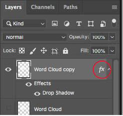
I went on to collapse the FX on the layer to save space in the layers panel by
clicking on the arrow and dragged the copied layer to the top left so it looked
like the below image.
I then duplicated the layers multiple times and moved them around the image
to cover the image. I also rotated the layer by 90 degrees to make the
text look less uniform by pressing the shortcut CMD + T to transform and
rotate. The finished result looked like the below image.


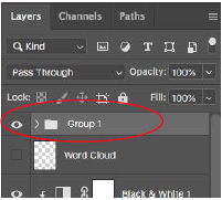
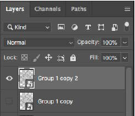
With all of my word cloud layers selected apart from the original I pressed
CMD + G and placed them into a group so it was easier to navigate around
the layers panel. I duplicated the group by clicking CMD+J and rotated it 90
degrees (CMD + T).
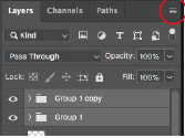
I made both groups active by selecting them both and clicking on the icon in
the top right of the layers panel. After, I selected convert to smart object from
the list and then made a copy of this, CMD + J and hid the lower smart object,
word cloud.
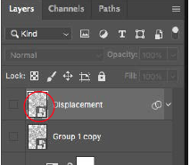
I renamed the top layer 'Displacement'. From the menu I navigated to Filter >
Distort > Displace and used these settings: Horizontal Scale : 10, Vertical
Scale: 10, Stretch to fit, repeat edge pixels and embed File Data in smart
object and clicked OK. I found my Displacement PSD file that I had saved
earlier and opened it in Photoshop. I then collapsed the smart filter and
pressed CMD + click on the thumbnail of the Displacement layer to make a
selection of its shape and then hid the layer. I made my subject layer active
and applied a layer mask.

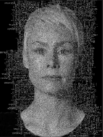

I made a composite snapshot of my image by clicking SHIFT + CMD + ALT +
E and hid all the layer below and dragged the composite snapshot to the top,
made the displacement layer visible again and changed the blend mode. I
played around with which blend mode looked the best. I chose Linear Burn.


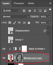
Finally I added subtle text behind the subject by making the lower smart object
work cloud visible (Group 1 copy) and dragged it to the top. I pressed CMD + click on the thumbnail of my subject layer to make a
selection of the shape which produced marching ants around the subject.
Then on my Group 1 copy layer, I pressed ALT + Click on the layer mask icon
to make an inverted selection and clicked off the chain link icon in between
the layer mask and the thumbnail.
Lastly I changed the opacity of this layer to 11% and readjusted the size by
pressing CMD + T and resized it. I clicked File > Save to save the image.
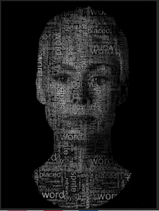
Below was my end results during the workshop and then the next one down is
using an image I took whilst we were in College of Fahad. I used text from the
Qur'an because Fahad is Arabic. On the image of Fahad I used a grey
background as I thought it looked more effective.


Comments