Marvellous Mono - Printing
- amiedodgsonart
- Oct 1, 2019
- 2 min read
Today we learnt how to do collage mono printing and I loved it! It was such an engaging and rewarding process to learn. It allowed considerable freedom in approach to imagery and I found it was very versatile, in the sense you could use a varied amount of methods and materials to get a desired effect.
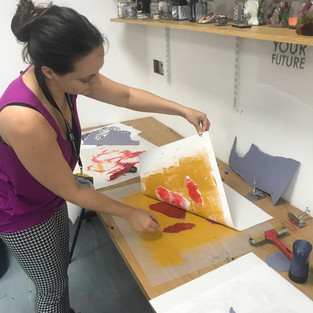
I used oil-based block printing watercolour ink. I began by placing down a plastic slab, taking some gold ink and putting it straight onto it and then used a roller to spread an even coverage.


Using torn up pieces of sugar paper I made an abstract pattern, inking it up with red on the back and placed them onto the now gold board with the ink facing upwards. Placing my background paper onto the now inked surface, I used the soft part of my palm to press down and rub across the page. Lifting the background up I wasn't immediately happy with it. I put too much gold ink on first and I could have been more creative with the placing of the red inked sugar paper.


After washing my plastic board of red and gold ink, I proceeded to put black ink onto the plastic board again with a roller. I forgot to take the excess off which again, which I felt ruined the picture. Using the sketches we drew in last week’s session I made the same markings with my pen onto the back of the background picture so they would show through with the ink on to my background. I experimented with making marks with my fingernails, the end of a pen and a biro. Overall I wasn't happy with how it turned out. I further developed my practice and experimenting.

Moving on to another piece, Bridie, whom I was working with painted on the background with blue ink this time, and the dripped gold ink over the top. I then added some dots of white ink and pressed it out. I did the same again with the black ink, this time making sure I got rid of any excess using newsprint and then drew my patterns through the back of the background. I really liked how this turned out. Much better than the first round! The contrast between the blue and gold ink was beautiful and then accents of white over the top really brought it to life.

The last piece was made from the background of what I was leaving my roller on in between processes after applying ink. I loved the effect it had created. You can almost see faces in this one. I love how the colours blend together. I spattered more ink on and then did another inking black round with mark making and it turned out great. It was most definitely a happy accident along with some of my own creative input! I have a naturally occurring theme in my work of negative space and that really shone through in my opinion. It also remind me of Japan!

Comments